A couple of years ago, during a particularly busy time at work (cough GOV.UK just before Brexit), a colleague added a UX research request to our already overflowing backlog of projects. It was more than we could take on. While we were discussing how to manage our workload fellow UX researcher, the lovely Louise Petre, remarked:
We are not insight vending machines
It’s one of those sentences that has floated around my brain since then. It evokes a vivid image of a long queue of stakeholders lining up to collect their insights. Packaged knowledge at the press of a button. Thud, another request fulfilled.
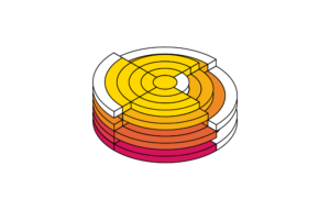
Vending machines we were not. Viewing the research process as such is reductive in all kinds of ways. But what if, just for a minute, we do think of ourselves as little insight machines? Whirring and creaking devices, designed to feed other parts of the organisational system?
Custom output settings
To paraphrase Caroline Jarrett, a UX researcher’s role is not to learn about users and their needs, but to help teams learn about users and their needs. As insight machines our settings should be optimised to enable and encourage this learning. What those settings look like is context dependent, only once you roughly understand the machinery that makes up your organisation can you begin to adjust your output accordingly.
As insight machines we are pretty complex devices. Part of our functionality is focused on how to collect data (input), another part converts the collected data into insights (processing), and then there’s a part concerned with how we deliver these insights to others (output). If we look at this last part, there are a bunch of settings we can configure. A few important ones:
Setting 1: cadence
The rhythm with which we share insights from research with colleagues
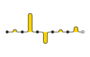
Setting a cadence can have a surprisingly powerful impact. A predictable schedule can build anticipation: people will know what to expect and they may even look forward to it. This was incidentally one of the main findings in my academic research on public data visualisations. You can design for anticipation by defining a manageable cadence for different types of output, whether it is a recurring bi-weekly meeting for usability findings, or a quarterly newsletter.
Slack feed of verbatim quotes
Example of high cadence output
One year ago, I was wondering how to engage more people in the research we were doing. Sure, there were research sessions people could observe, and videos, and presentations of findings, but I was looking for something lighter, something with a very low barrier to entry. We occasionally shared relevant user quotes with colleagues in different Slack channels, so why not do this more often, and in a more structured way?
I set up a Slack channel to share verbatim user quotes with colleagues across ~10 multidisciplinary teams. Three times a day, at 09:00, 13:00, and 17:00, my colleague Juliana and I post a new quote. We schedule the posts in advance to minimise the workload. We also manually curate them to show a variety of user types, products, and where possible sentiment. We source all quotes from interviews, workshops, surveys, support queries, and social media.
Over the course of the year, more than 150 people joined the Slack channel, far beyond the initial target audience. Anecdotally we know some colleagues have made reading these messages part of their daily routine. Colleagues in other business units have since set up similar channels.
Setting 2: reach
Who we share insights with
When we uncover something new, do we shout about it from the rooftops, or share it in a more targeted way? Highly specific insights should obviously reach those who can take action on them. Sharing such specific insights more widely can alienate people, they may not know what you are talking about and how it’s relevant to them. Conversely, broad insights may be relevant to swathes of people across the organisation, but sharing such insights with someone directly can leave them wondering what they are meant to do with this information.
Bitesize insights
Example of high reach output
During a monthly global ‘all-hands’ we, the UX research team, have a 5-minute time slot to share recent research findings. This is by far the furthest reaching of all our communications, so we focus on high-level insights that are of interest to a very broad audience. My manager Kathryn manages the allocation of slots and makes sure we rotate who presents to minimise our workload. To keep things efficient we also reuse the same slide deck template, which I designed to be simple, restrictive (it allows for only 3-4 high level insights), and more visually fun than the average slide deck in that meeting, so that what we present stands out. This is a corporate context, so visually fun refers to the use of some basic colours and images.
Setting 3: exposure
Stakeholders’ distance to users
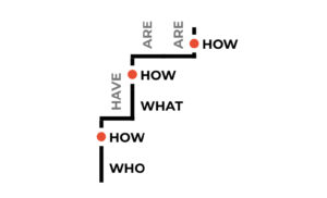
There is something fundamentally different about hearing about a thing directly from the source compared to listening to the story being retold. In some organisations a minimum number of “exposure hours” is explicitly defined: how often and for how long people observe user research. The Nielsen Norman Group has even defined what activities they don’t count as exposure, including interviews, focus groups, and surveys. I am much more pragmatic than this, I think we should encourage all types of exposure. In fact, I think it’s great to have a range of ways to learn more about/from users, from very easy to requiring more effort. My minimum engagement threshold starts at stakeholders reading an executive summary of a research project. Do they also listen to audio snippets, or watch video fragments from research sessions? Better. Observe and take notes during sessions of users using their products? Even better. Join and get involved in a site visit? Amazing!
Cinema session
Example of medium exposure output
Once a quarter I host a remote ‘cinema’ session during which I play a compilation of redacted videoclips from recent user research. I source the videos from one-to-one interviews, usability tests, and group research. The cinema sessions are purposely not recorded, to minimise the distribution of participant data, and as a result it nudges people to attend. I add subtitles to make it easier to follow what participants say. I play the videos back-to-back, without commentary, so all discussion has to take place in the chat. And that chat can get lively.
Setting 4: medium
How insights are packaged
The medium matters: some people prefer details while others need the big picture, some prefer reading while others like the liveliness of videos. In short, your insights should exist in a couple of formats, partly informed by your organisational culture (e.g. if they only ever use Powerpoint).
Multimedia bonanza
Example of high variety of medium
As the previous examples have already shown, we communicate insights in multiple ways. An average research study will have:
– Direct exposure: people observing the research sessions
– A presentation for stakeholders (storytelling, slides, audio/video)
– A presentation for a broader audience with higher level insights
– We’ll share some video clips in a cinema session
– We’ll post select quotes on the Slack channel
In addition, the study’s findings can be used in a ‘bitesize insights‘ presentation, or referenced in an internal blogpost.
Halt
And that’s probably where the insight machine analogy should grind to a halt. These settings are just one aspect of our machinery, thankfully. Work would be pretty boring if we were only focused on the output part. Still, it’s helpful to think of these processes and rituals as switches and dials that we can adjust as needed.
After all, one size fits one.


