During the analysis phase of research I attempt to make sense of my collated qualitative and/or quantitative data. To do so, I typically try to create diagrams that allow me to compare aspects of the data. I personally find that such a visual approach enables me to interpret and comprehend research data much more easily.
To be more specific: I frequently end up doodling a ‘small multiple’, a data visualisation format consisting of a grid of small graphs which all use the same scale and axes for easy visual comparison. You can often find small multiples in news articles that compare a metric across geographies, and they generally consist of a series of line charts, bar charts, or maps. I prefer to stretch the format to other types of comparable visual representations too. And rather than comparing economies or cities, I use the format to compare data collected from individual participants.

Example: workspace observations
Sketches of the desk layouts of 3 participants, distinguishing digital devices from paper.
Finding a language
To find a suitable visual language, I spend time exploring the data – preferably as part of a team. The starting point is the research hypothesis: can we do a visual comparison of what we assumed versus what we observed? What data sources do we have? Which of the data points could we visualise? For quantitative data this is more obvious: time, clicks, responses, journeys, etc., but with some effort most qualitative data can often also be visually depicted and compared in some way.
This is when I start doodling, trying to make sense of the data by drawing it in various ways. I stick to basic shapes: circles, boxes, and lines. This is about making sense of the data, not about intricate visualisation techniques.
The key is finding an approach that allows you to standardise the scales and axes across all participants, so that you can compare them fairly. The pivotal moment is when I eventually stumble upon a seemingly helpful visual language: now I can create a small multiple that includes diagrams of all participants to see if it is a helpful aid in understanding the data and any potential patterns within it.
For this initial exploration I tend to work with pen and paper. Only when I’m starting to get somewhere do I move to a digital tool like Miro.
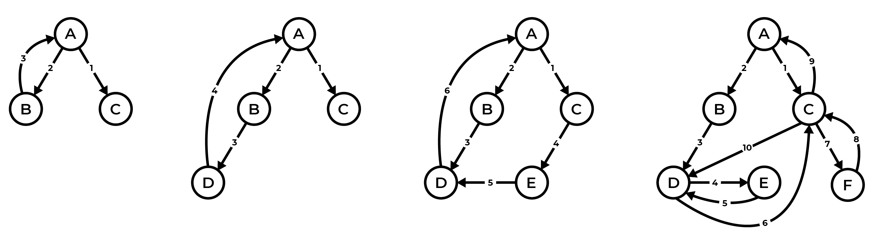
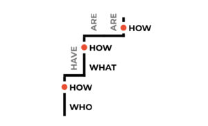
Example: actors involved in a process
The diagrams show a process as described in interviews with four participants. Circles represent the different actors involved in the process, lines show the communication between them, and the numbers indicate in which order that communication took place. Prior to the research, the assumption was that the process would typically involve 3 actors: A, B, and C. Across 14 interviews, however, it became apparent that the process is often much more complex.
Zooming in and out
The main strength of the small multiple format is that it requires you to look in great detail at individual participants. Only by fully understanding the data from an individual can you create and play around with potential visual languages.
After focusing on the creation of these participant views, you are rewarded with the ability to zoom out: thanks to the standardised scales and axes you can now look at the bigger picture and any potential patterns across participants.
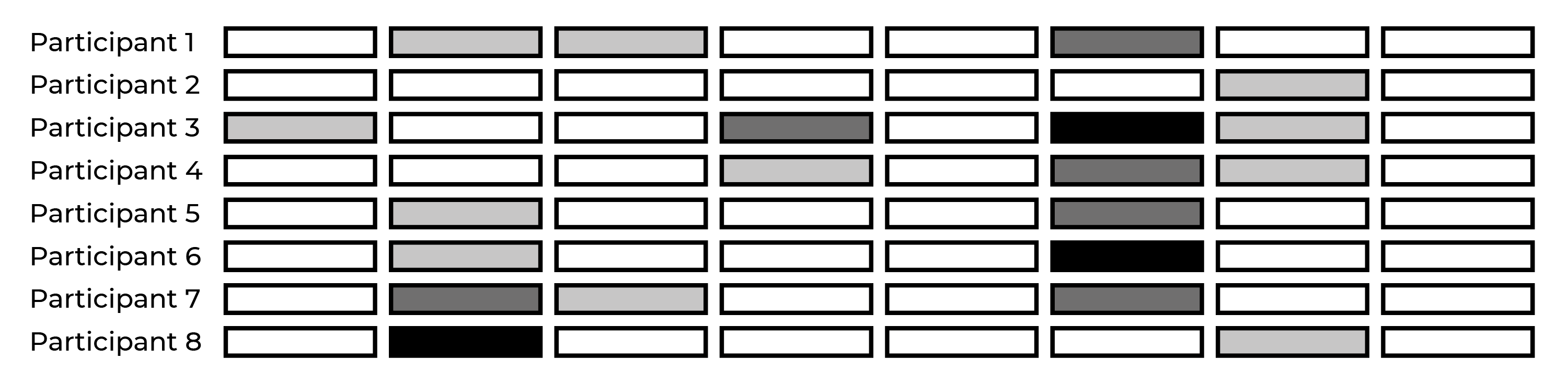
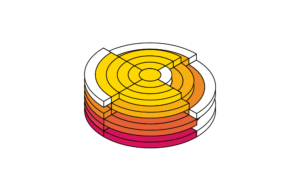
Example: severity of issues in each step in a journey
A simple and common one: mapping the severity of issues for each participants against each step in the journey.
Storytelling
In the context of user research, small multiples are artefacts that aid analysis and synthesis by showing patterns across participants – which in turn may help me discover and formulate insights. Note that small multiples make up just one part of any analysis effort, which may also include things like debrief discussions, qualitative coding, statistics, and so forth. I do, however, find it a particularly fruitful approach – there’s something about the detail vs abstraction that helps achieve clarity.
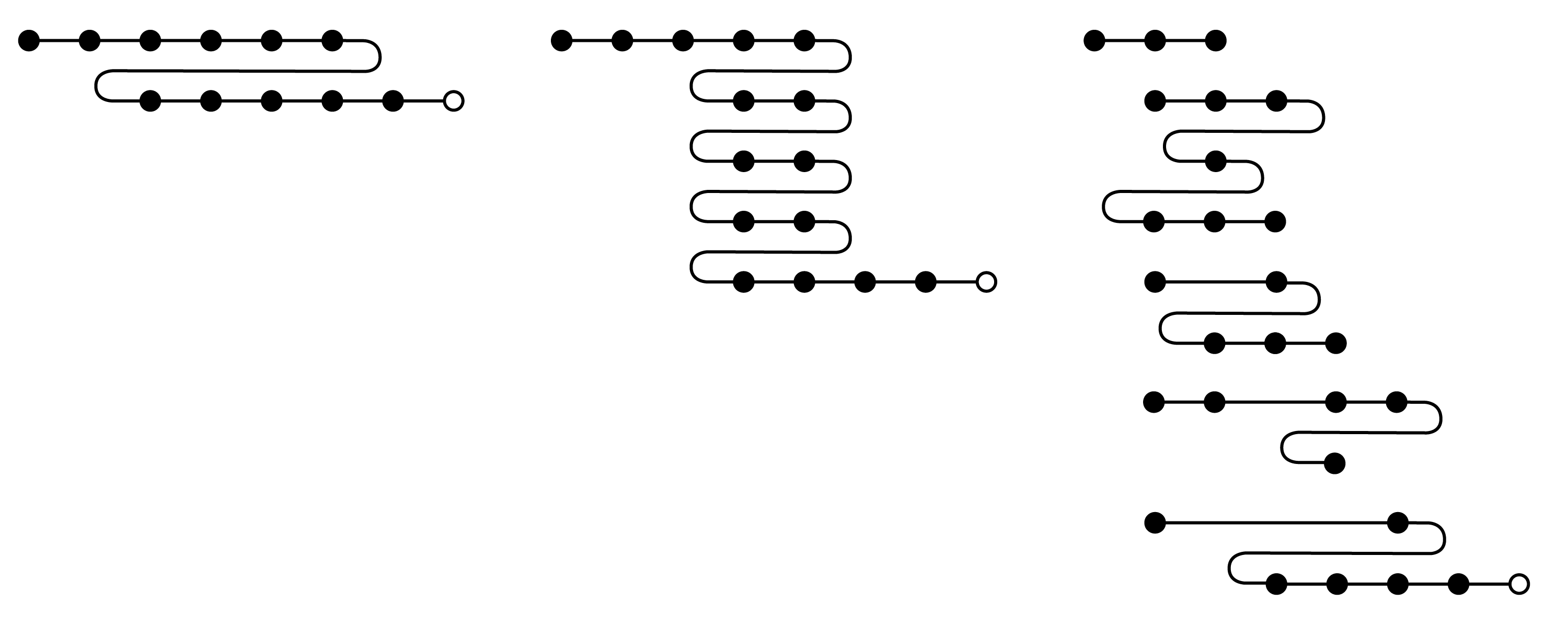
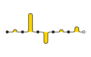
Example: journey analytics
Visualising the log data from a sample of 3 users to understand their experience in a more granular manner than aggregate flow diagrams can show. The black dots represent pages, a white dot indicates journey completion. Whenever a page follows the previous page, we continue in a horizontal line along the x-axis. When the user revisits page, it appears underneath the last visit on the y-axis. If the user visits multiple pages within the same session, the pages are connected with a line. If the user completes the journey in multiple sessions, the pages are not connected. See also my previous posts on visualising linear journeys and non-linear journeys.
Small multiples can also be a helpful addition to research reports, to demonstrate how the analysis was done, to enable others to understand the participants in more detail, and to help convey a narrative. Effective visuals often stick much better than words.