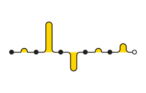
Previously I wrote about visualising the analytics data of individual users’ journeys using the following notation:
At the time I concluded by saying:
The transactional nature of the example in this blogpost makes it relatively straightforward to come up with a simple notation – I’m still figuring out how best to visualise data from non-transactional non-linear services.
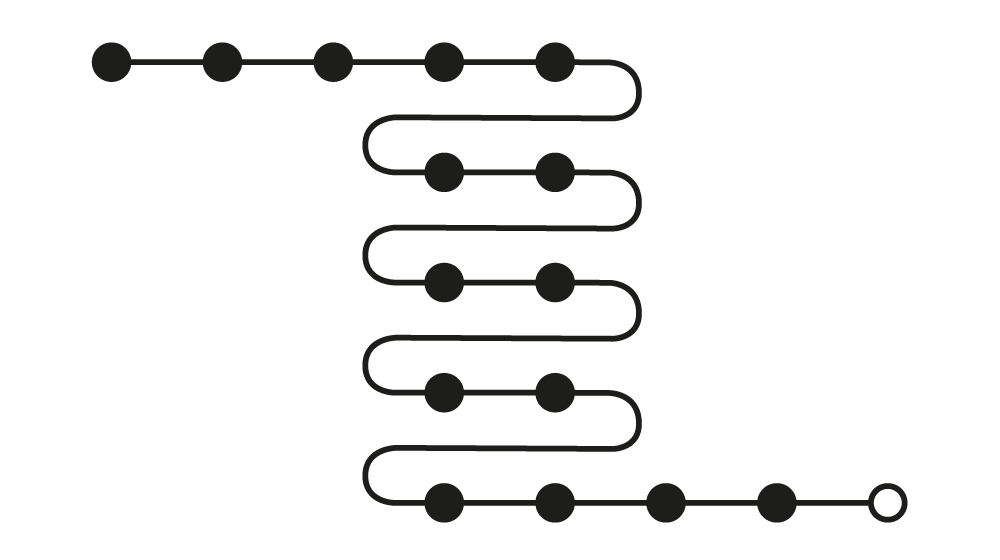
So here we are, time to think about it some more. The notation above works well if you have a journey with sequential steps and a clear beginning and ending. Like submitting a job application. Now imagine the person on the other side, who is managing all the incoming job applications. When they use the system, their journeys are likely to be much more varied, as they repeatedly carry out a bunch of different tasks:
- Monitor incoming applications
- Check on the completeness of applications
- Forward applications to the relevant hiring managers
- Check on the status of forwarded applications
- Inform the applicants of the outcome of their application
Within each of these tasks, there can be dozens of subtasks. At work I am trying to understand patterns in users’ behaviour in a system somewhat like this. Think of it as a case management system with numerous different pages, all linked in a myriad of ways. Attempting to visualise individual journeys quickly results in chaos.
So I’ve been meaning to try something different.
Let’s start by giving up completely on mapping the system’s information architecture. The notation we used for linear journeys assumed there was a start and an end, and a sequence of steps in between. For these journeys there is no such thing.
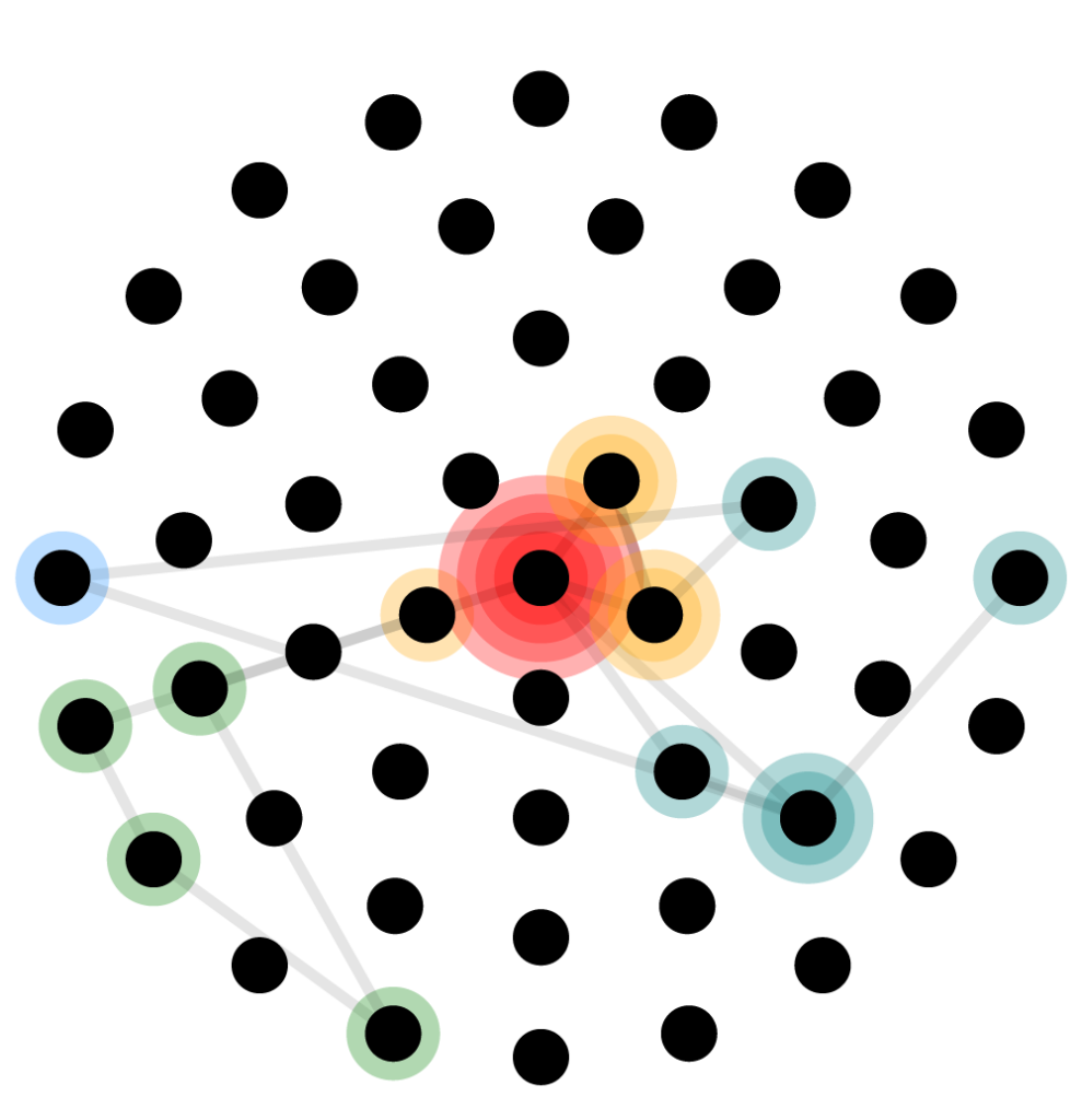
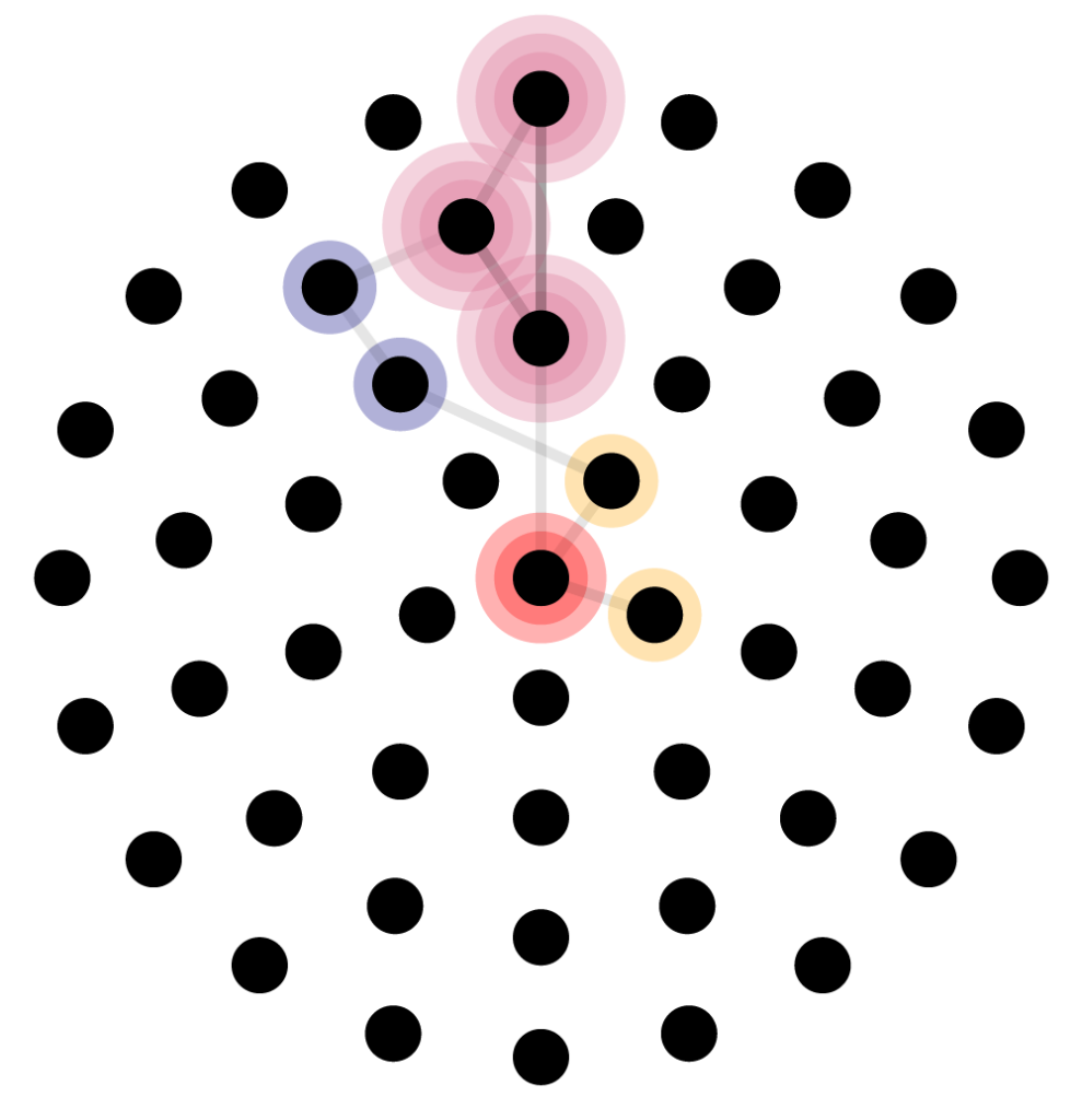
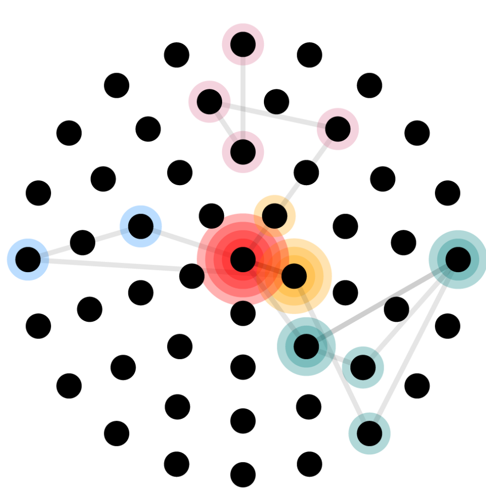
We’ll again use dots to represent pages. Below are all the pages in the system. The homepage is in the very middle, surrounded by five overview pages: ‘new applications’, ‘applications that have been sifted’, ‘applications currently in the interview process’, ‘applications with interview feedback’, ‘successful applications’:
Beyond that, let’s assume users can go to any page in any order. We’ll group the other pages by task:
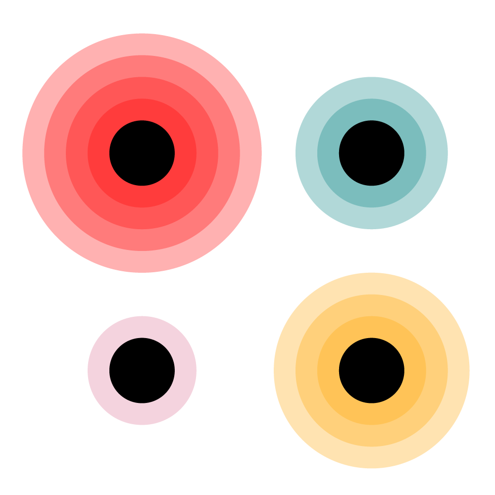
Now we can attempt to plot a user’s journey, to see how they move from page to page. But rather than just depicting the user’s behaviour visually, I’ve been keen to try data sonification. Well, some very basic sonification: adding a distinct sound to each type of task, so that you can (theoretically) detect patterns or oddities by listening to the data:
This is just a first concept of how you might analyse patterns in non-transactional non-linear journeys, so there is lots to improve. The audio is primitive and not as granular as the visual representation. While the visual end result tells a story, there is no equivalent sonic summary. You'd have to replay all of it. Still, something about it feels promising.
Side note: my PhD focused on public visualisations, so I can't help but think of the potential these beeps have as a soft ambient sound in a liminal space. A sonic equivalent of one of Weiser's examples of calm technology: the 1995 'Live Wire/Dangling String' installation by Jeremijenko – a string which whirled at varying speeds to convey how much data was transferred through a nearby Ethernet cable. Listening to patterns in user behaviour while making a cup of tea.
Visually, the end result of the three animations show distinct patterns, with some users carrying out tasks that others do not. Some users repeatedly do the same tasks, others much less so. I'll need to experiment with how much data can be shown in one go: one session, one day, one week?
There are two aspects that I think will be particularly insightful for the non-linear data I'm working with:
Relief: by treating the pages as a landscape of dots, we can start seeing difference in 'gradient' between areas in the system.
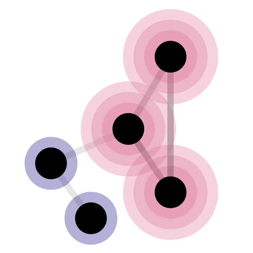
Traces: by using a low opacity on the paths between pages, over time we can see which paths are taken more frequently.
All in all another worthwhile experiment, but much more trial, error, and iteration is required. As always, any thoughts and suggestions very appreciated.
Links
- Audio tones made with https://pro.sfxr.me/
- Much more professional data sonification: https://sonification.design/