Analytics data is typically used to better understand behaviour at scale: where do users go first? Where do they go next? Which pages do they spend most time on? Where do they get stuck?
These questions are usually answered by looking at the aggregate data of many users. Looking across many users helps spot patterns. But: it also masks the nuances of individual experiences. What if, instead, we dive into the nitty gritty details of the journeys of just a handful of users? What if we explore a small number of individual journeys with the depth and attention of a more qualitative research approach?
Over the last few months I’ve been doing various ‘small data analyses’: manually trawling through extensive spreadsheets of analytics data, and figuring out how to make sense of this data.
The problem
Aggregated analytics data provides a big picture overview of what users generally do. It can be visualised in various ways, for example as a flow diagram. Such a visual representation can help uncover where a service might have problems (e.g. a lot of people getting stuck).

However: aggregated analytics data hides the intricacies of the distinct paths users took. To me, those intricacies feel like the interesting bit: they tell a rich story of how a single user actually experienced the service, much closer to the type of information we seek using more qualitative methods.
(And given that analytics data is usually already being collected, let’s learn as much as possible from the wealth of available data rather than collecting new data)
The example
As I am not able to share the data from the service I am working on, let’s go through a fictitious but comparable journey: applying for a job. The initial application is a transactional journey, usually roughly involving the following steps:
- Click ‘apply’ on a specific vacancy
- Log in / Create an account
- Enter your personal details
- Upload your CV
- Check or provide your past roles
- Upload your cover letter
- Review your application
- Submit your application
And then the application is complete. In the days, weeks, and months that follow there may be many more steps, but let’s limit our scope to this initial application.
The data
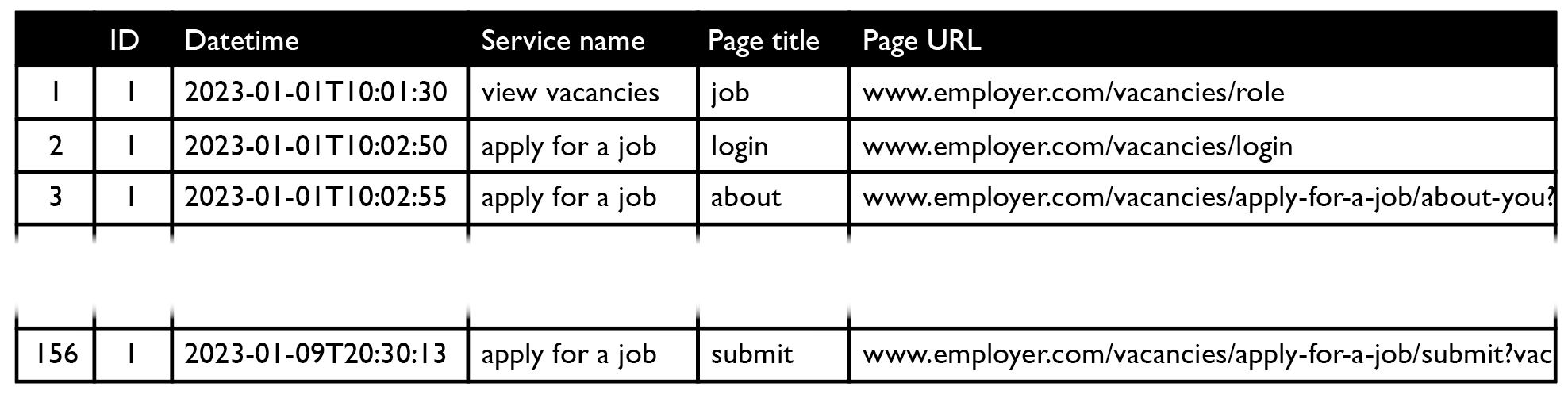
To learn more about the application process, we will need analytics data. Specifically: clickstream data, which shows how users traversed the service. This may look something like:
Before it can be used, the clickstream data will likely need to be cleaned and prepared.
The notation
Now, while we – the theoretical makers of the job application service – hope that users can smoothly make their way from step 1 to step 8, the reality is often much more complicated. Grasping what real application processes look like is difficult from raw data, so let’s visualise it.
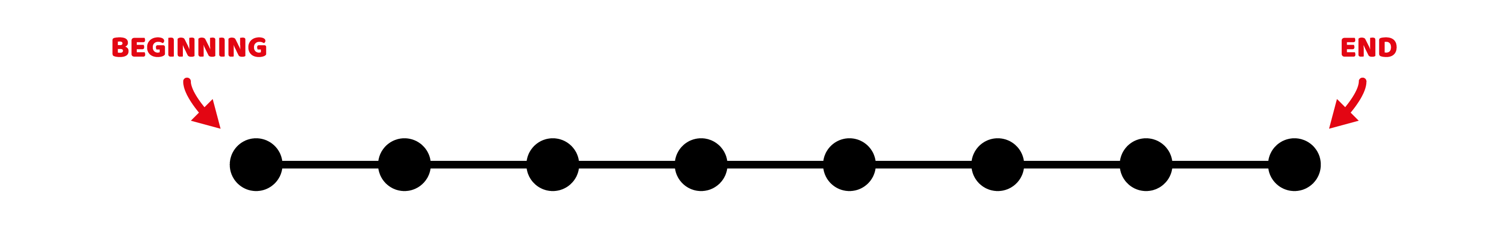
Path notation
The service is transactional and has a clear beginning and end. It is designed to be completed in sequential order. So let’s use a basic left-to-right timeline, with a black dot to denote each page the user visits. A perfect job application process would look like this:
Back-and-forth notation
Although the journey is designed to be completed in sequential order, in practice people frequently return to previous pages. So: we need a way to distinguish between a visit to a new page and a previously visited page. For new pages, we’ll place the pages in order on the same line. For visits to previously visited page, let’s loop back to the first occurrence of that page, and continue the path directly below it:
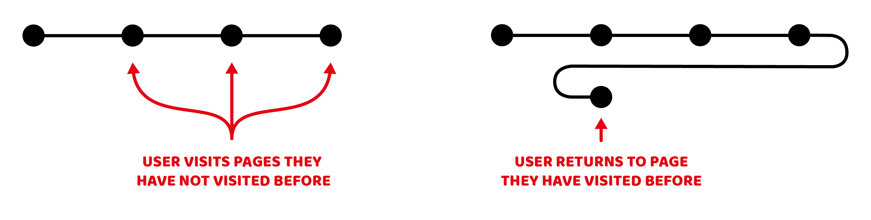
This notation makes it easy to see to which pages people return, and it also ensures the visualisation has a fixed width: if users go back and forth between pages a lot, the visualisation will simply grow vertically.
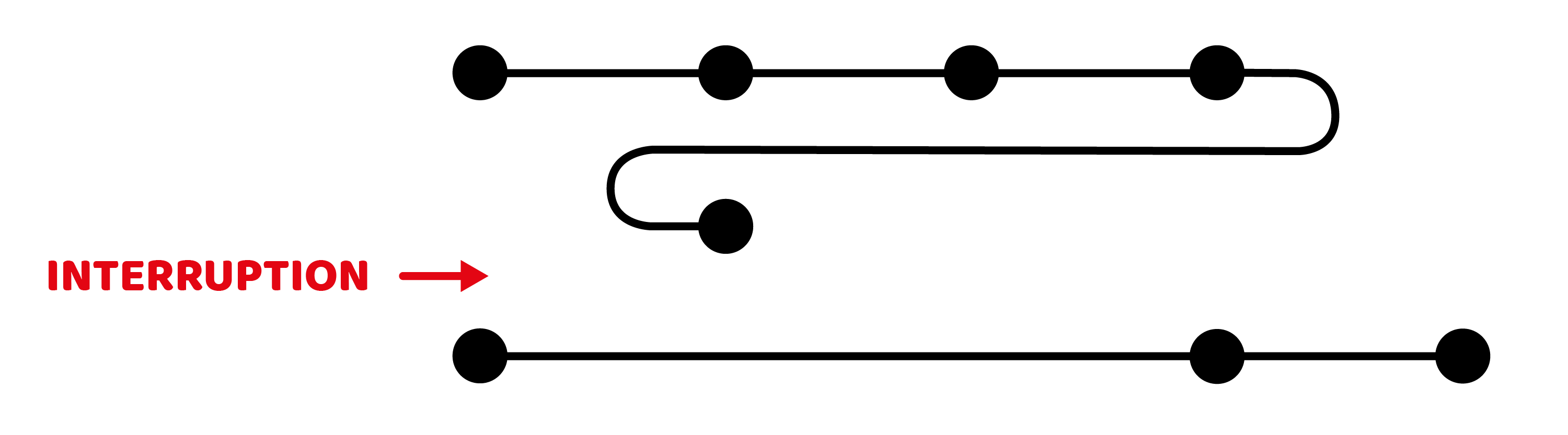
Interruption notation
Users may not complete all the steps in one go, for example if they realise they are missing the information needed to proceed. As such, we also need a way to signal the end of one session and the start of the next one. Let’s do this by only connecting pages that have been visited in the same session:
Success notation
And finally we need a way to denote ‘success’ – the application has been submitted. Let’s present this using a white dot at the far end of the line:

The visualisation
Now that we’ve established a notation, we can visualise our analytics data. The aim here is exploratory: our aggregate data can tell us about overall success rates, pages with a high rate of people abandoning, etc. Here, instead, we want to look in detail at individual experiences.
Let’s look at some examples:
The double-checker?
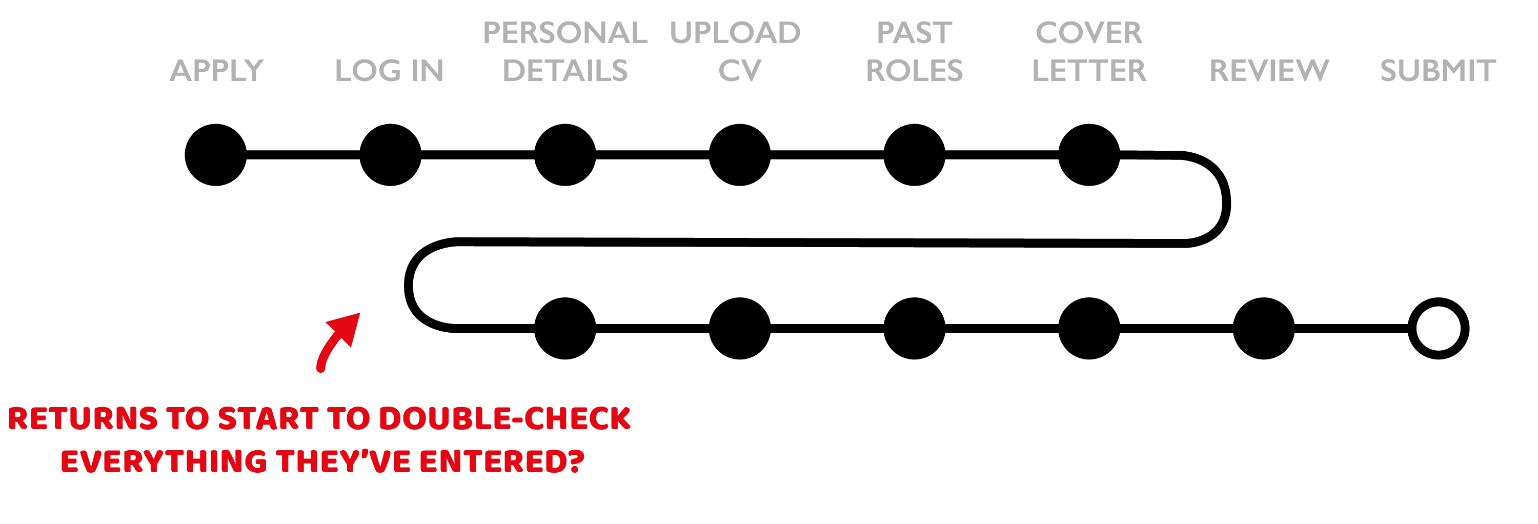
Applying for a job is an important thing: as an applicant you are presumably keen to convince the employer you’re a suitable candidate and you don’t want to mess up your chances because of mistakes on your end. For high-stakes transactional services, it is therefore likely you’ll uncover double-, triple-, or quadruple-checking behaviour.
The prepare-as-you-goer?
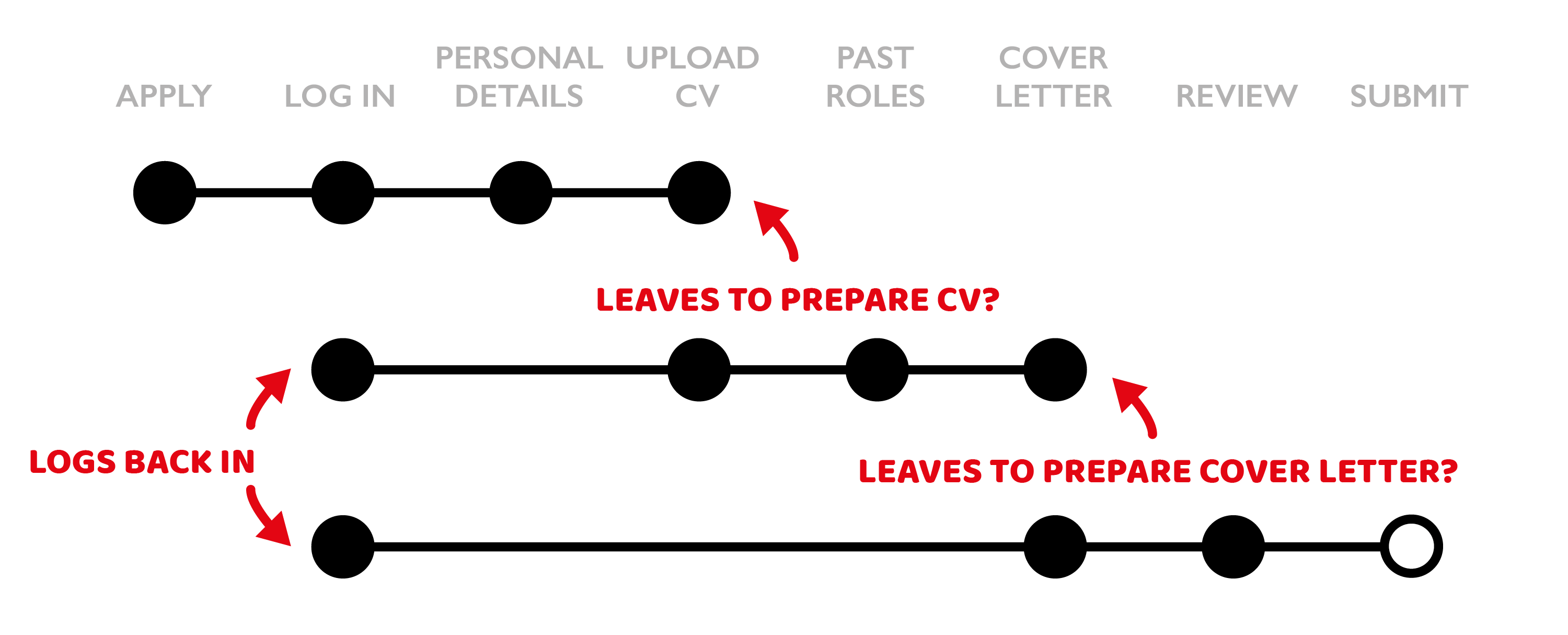
It is also likely that you’ll uncover patterns in session interruptions at points where (important) information is required: a user may go off and update their CV, log back in only to find they also need to update their cover letter. They will likely skip several pages and go back to where they left off.
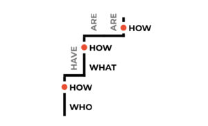
The problem page?
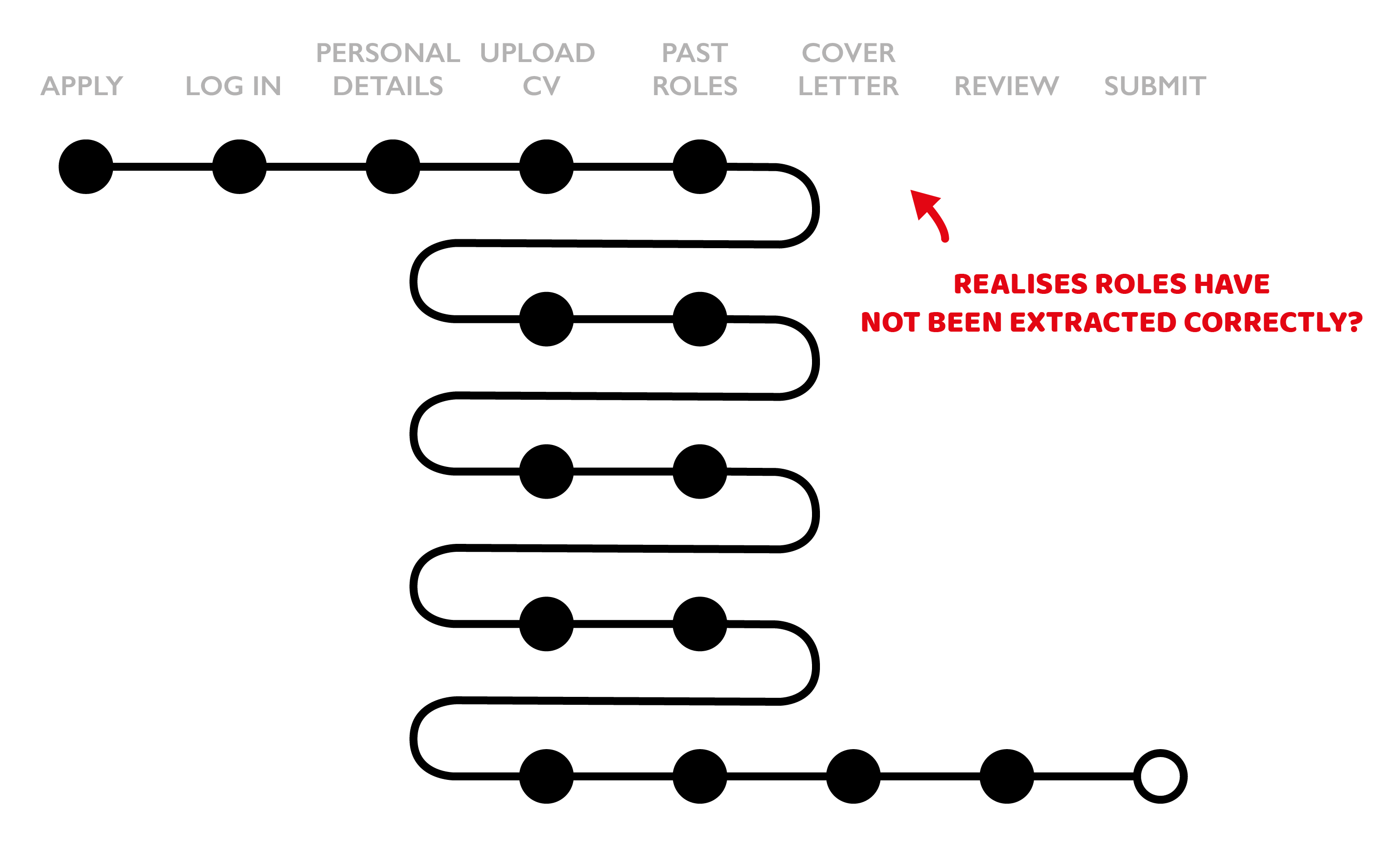
In addition to patterns in behaviour, it may also be possible to spot problematic pages. Anyone familiar with job application processes that attempt to extract role information from your CV may recognise the pattern above: the extraction has not gone well, you may try to make some CV changes and try again, and again, and again, before eventually giving up and manually entering the required information. Painful.
The what now?
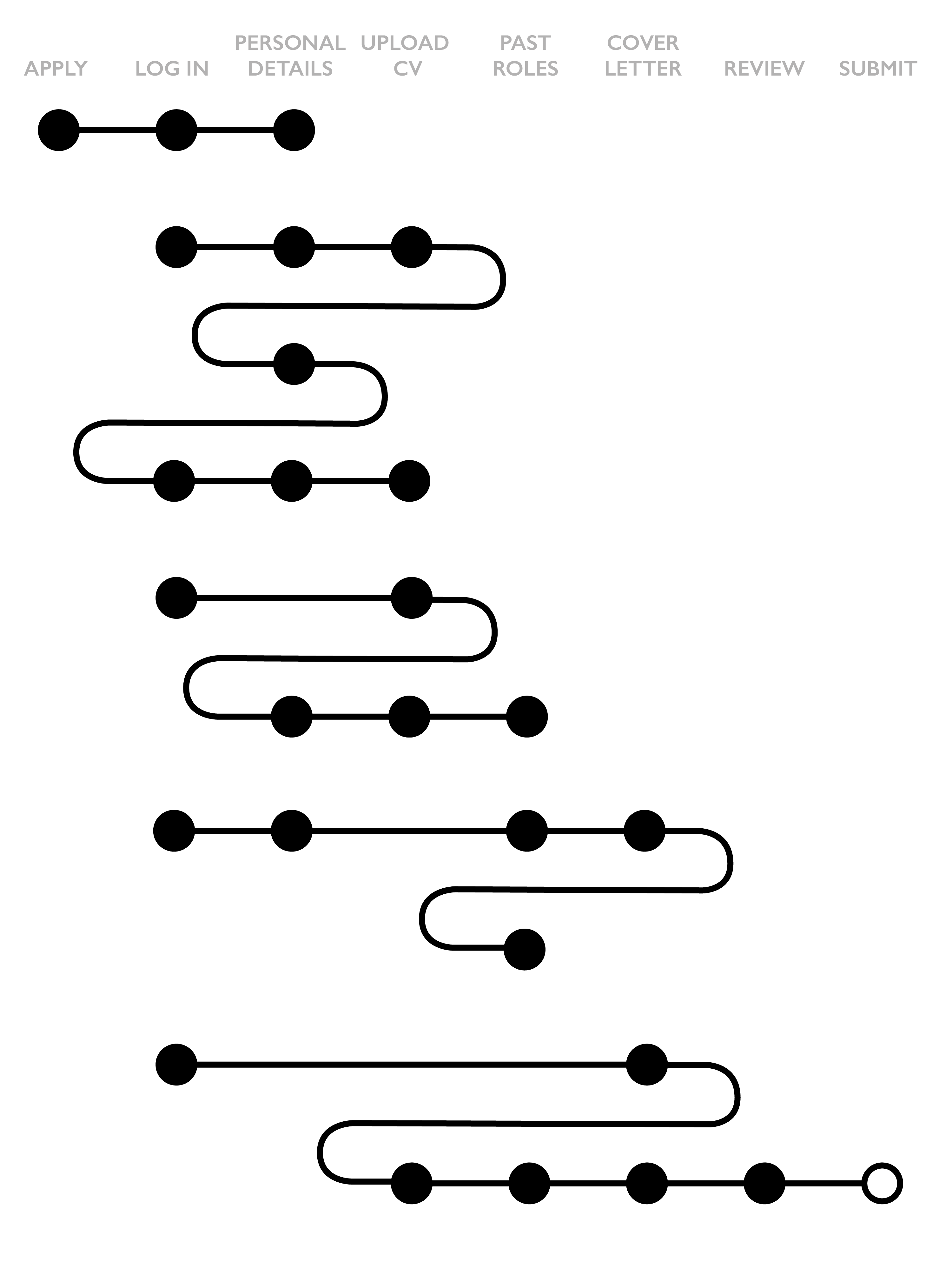
And then there’s a category of overwhelmingly complicated multi-session journeys that cannot easily be explained. Perhaps all of the theories above apply, perhaps they are experiencing technical issues, perhaps they are multitasking – who knows. If this category is significant, it may be helpful to start qualitative research and observe and interview users applying for jobs.
The learnings
Visualising analytics data like this for the service I work on helped in several ways:
- It validated several archetypes we had identified through qualitative research, and revealed potential new ones
- It highlighted and stressed pain points that our previous studies had also uncovered
- It has raised new questions that we can now investigate further with other methodologies, including about quantifying the archetypes, understanding multi-session journeys, and classifying levels of friction
- It made the detail within journeys more visible for stakeholders: high level metrics such as completion rates can suggest a service looks healthy – but they don’t tell the story of the effort it took to complete
There are of course also plenty of limitations with this approach: focusing on a small sample of users can give an unrepresentative picture of overall behaviour and should be combined with other approaches. Analytics data itself can also give an incomplete picture if users opt out, remove cookies, or work across multiple devices.
The next steps
The notation above is just one of several attempts to make sense of clickstream data: I created different visualisations to explore where users spend most time, what types of activities users spend most time on, and to create a more longitudinal view of interactions (6+ months). Initially these explorations were entirely manual, now I am making use of D3.js to speed up the process.
The transactional nature of the example in this blogpost makes it relatively straightforward to come up with a simple notation – I’m still figuring out how best to visualise data from non-transactional non-linear services. Thankfully experimental music notation offers plenty of inspiration!
Thanks to Nico Zazworka and Jonathan Warner who have encouraged and supported these small data analyses.
Tangentially related to all of the above: ‘Stuck? Diagrams help’ by Abby Covert is an excellent book.